Dífferos.
The identity of Dífferos, my brand consultancy: a system built on the universe of identification (fingerprints, DNA, topographic maps) to help every brand find its differentiator and make it irresistible. Naming, logo, four pillars of identity, applications and website.
01
Context
Dífferos is the brand consultancy I launched in Venezuela: I help brands differentiate themselves and position against their competition through growth strategy and identity development. As a consultant, my mission is to find what makes each brand unique and communicate it clearly, both visually and verbally.
To embody that purpose, I built a corporate identity that is itself a demonstration: it highlights what makes it distinctive and communicates it in a direct, memorable way.
02
Concept: the universe of identification
The concept is born from the universe of identification. I drew inspiration from fingerprints, tree rings, topographic maps, barcodes and DNA patterns: elements that symbolize the unique and unrepeatable, and that serve as the visual and conceptual foundation of the brand.
The goal is to help each client identify their differentiator and leverage it to attract stakeholders and position themselves strategically in their market.
03
Naming
I was looking for a name that captured the essence of differentiation in a clear and appealing way: a neologism that united two ideas: uniqueness and attraction.
"Diff" (the programming term for comparing files and detecting differences, as in `git diff`) resonated with standing out as unique. "Eros" (from psychology and mythology, attraction and desire) brought the emotional dimension. From their fusion, Dífferos is born: to stand out and be irresistible. It is, literally, the consultancy's value proposition.
Ficha de Nombre
España · LatAm · legible en inglés
Dífferos
/ˈdi.fe.ɾos/
Significado
Composición de «Diff» —el término tech para encontrar diferencias, como en `git diff`, y contracción de «diferencia»— y «Eros», el dios griego de la atracción. Dífferos = encontrar lo que te hace diferente y volverlo atractivo. El nombre es, literalmente, la propuesta de valor de la consultora: marcas diferentes y atractivas.
Ruta y técnica
Neologismo · Composición (Diff + Eros)
Atributos que activa
Disponibilidad
Dominios por RDAP (fiable); redes orientativas, confirmar a mano.
Disaster check
limpio · revisado en es, en, pt, it
Sin lecturas negativas. El sufijo «-feros» evoca «fiero/feroz» (fuerza), no algo peyorativo, y «Eros» queda en la etimología, no en la superficie (ninguna lectura sexual directa). Único riesgo: ortográfico — al llevar «ff», hay quien escribiría «Díferos» con una sola f; conviene asegurar también ese dominio y handle (diferos.com está libre).
Evaluación
04
Logo
I designed the logo from a fingerprint placed horizontally to form the initial "D": identity and concept in a single stroke. The typography is custom-made, built with line structures that allow the weight to vary and create dynamic, adaptable compositions.
The colors, burgundy and navy blue, came out of market research: burgundy was hardly used by the competition, so it was an opportunity to be instantly recognizable. It also conveys formality, elegance and an emotional connection with love and passion; the navy blue in the typography brings solidity and a contrast that enhances the icon.

05
The four pillars of identity
I developed a comprehensive identity that balances flexibility and consistency, organized into four pillars, each tied to one of the consultancy's services.
Brand DNA: the essence (story, milestones, promise, archetype and ideal client), connecting identity, values and audience. Verbal identity: the language (naming, tone, voice, tagline and audio branding) for cohesive and distinctive communication. Visual identity: logo, typography, color, patterns, icons and applications across stationery, packaging and multimedia. Spatial identity: the brand carried into physical and digital environments (retail spaces, scents, apparel, vehicles, social media and UI/UX systems) for immersive, consistent experiences.

06
Applications
The identity is applied consistently, with the concept always present: a business card that combines the fingerprint and an NFC-enabled QR code ("digital experiences"), and campaigns that bring differentiation to life (from the "SAME / SAME" versus Dífferos to the "Brand Fortress" as a metaphor for an impregnable brand). Everything is captured in a brand engineering manual.


07
Website
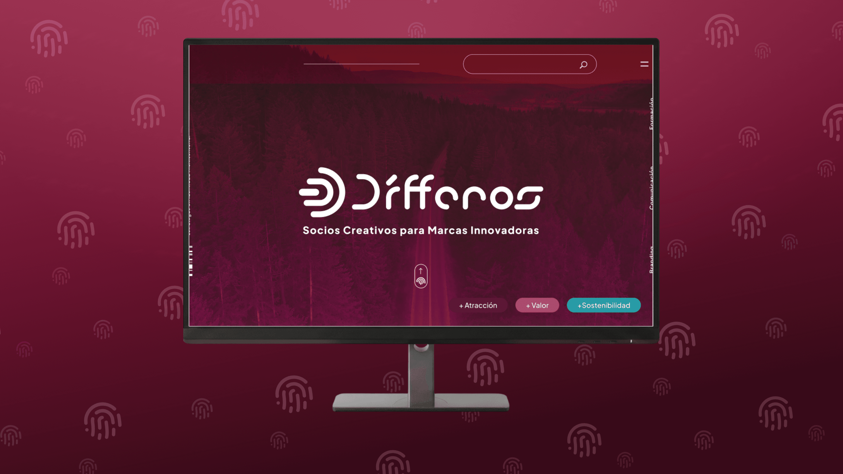
The website carries the identity across in an elegant, natural and technological way: clean, intuitive navigation, and graphic elements inspired by identification patterns (topographic map textures and audio spectrums) that reinforce the core message. Optimized to showcase success stories and services, with an immersive, professional experience.
08
Results and reflections
Creating Dífferos fused analysis, creativity and strategy, and became a practical example of the power of strategic differentiation. Every element, from the naming to the website, points to the same communication goal, proving the effectiveness of a well-executed identity.
As a consultancy, Dífferos was also a laboratory: the excuse to systematize how a brand is built by pillars, something that today is at the core of the way I work.
4 pilares
DNA, verbal, visual and spatial: a comprehensive identity, from essence to space
Have a similar
project?
Now that you've seen a bit of how I work, tell me about yours: let's treat brand, product and code as one system.
Let's talk about your project